

Overview
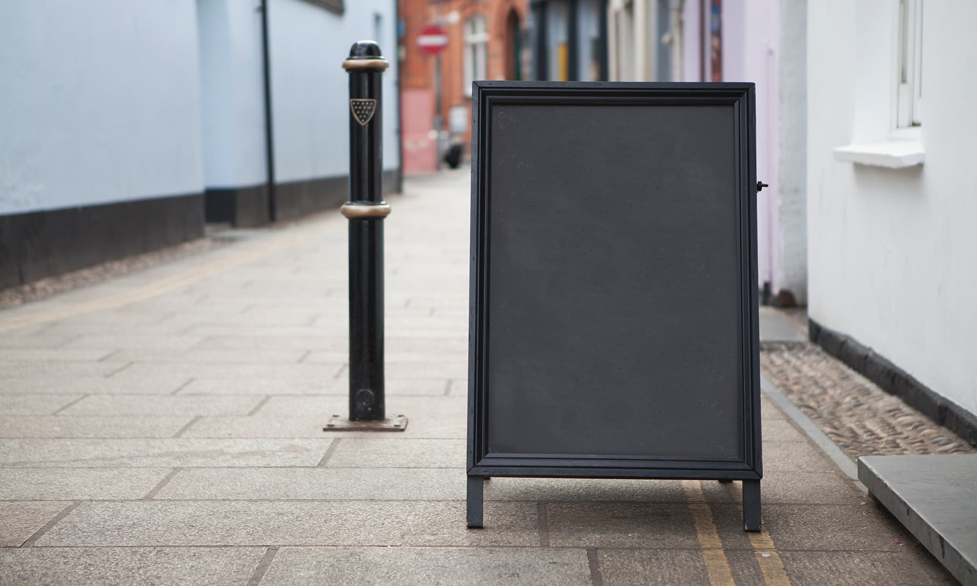
A-frames, also called Sandwich boards are an advertising standard for a reason. Not only do they demand attention, but they’re also versatile, affordable, and mobile. That said, they only work if they’re designed effectively. Fortunately, we can help with that.
For this case study, we’ve created Origin Coffee Roasters as a stand-in for our clients that we feel use sandwich boards most successfully. We’ll go over some design principles such as emphasis, contrast, and typographical hierarchy. There’ll be some copywriting tips too!
Let’s jump in.
Topics Covered
Starting your A-Frame Design
What Should You Consider First?
Designing an effective A-Frame should always start with the information you’re trying to convey to your customers. Do you have a promotion you’d like to advertise? Perhaps a new product to pitch? Old stock you’d like to turn over?
The important thing here is to pick one, maybe two directives you’d like to get across. Anything more dilutes your intended message. Remember, you only have a few seconds to get your message across.
Emphasize Key Information
After choosing your message, it’s time to highlight it. There are a bunch of ways you can achieve this, but emphasis should be the first thing you consider.
Emphasizing something is often pretty simple. Eyes are usually drawn to the thing that stands out, so just make it bigger, bolder, and brighter. The trick here is to know when to stop. It’s easy to get a little overzealous and make everything big or bold and when you try to emphasize everything, you emphasize nothing.
Our advice is to pick the most important part of your intended message and make that the biggest part of your sandwich board. Usually, this is text, but it can be an image too.
Utilize Contrast And Hierarchy
If emphasis is our superhero, contrast and hierarchy are our sidekicks. They can provide some backup to accentuate our sandwich board messaging.
Of the pair, contrast is likely what you’re more familiar with. It’s used to provide even more emphasis to an element. Let’s say you’ve got your main message bigger and bolder than the rest of your text, but it’s all the same colour. Well, you could add more contrast, and thus attention by changing that main message to a bright red.
Hierarchy is used to achieve the same thing as contrast but through organization and order. People scan items before actually reading. It’s a shortcut our brains use to find the most valuable information first. We also tend to do this in the same pattern, left to right then top to bottom. Like reading a book. Take advantage of this by putting the most pertinent information towards the top.
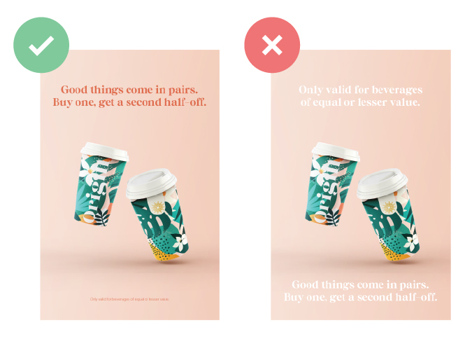
Use Actionable Wording
Now that you’ve chosen the information you’d like to advertise, let’s punch it up.
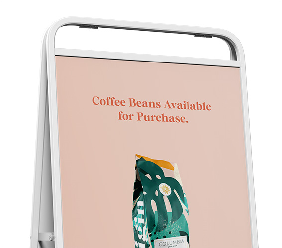
What sounds better? “We have new coffee beans available.” or “New! Our boldest beans yet. Get them while you can!” Your message should clearly tell people what they can get from you. Try to inspire curiosity, create a sense of urgency, or garner excitement with your message.
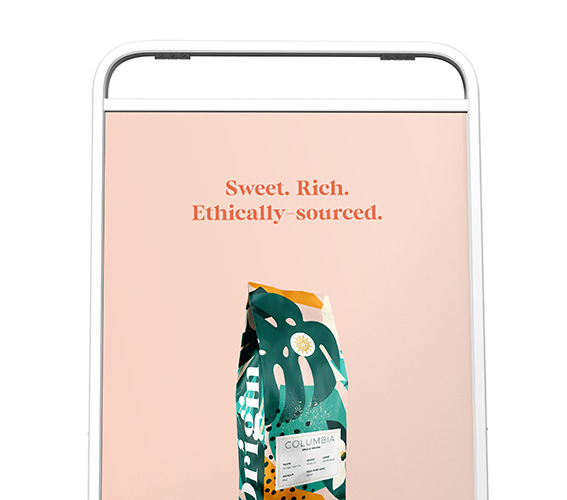
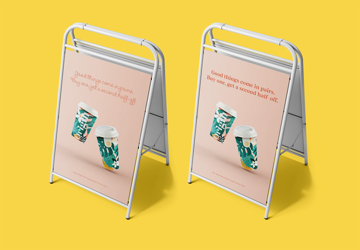
Our Design Decisions
Origin Coffee is a specialty coffee shop that serves beverages using quality beans, as such we kept the design minimal to draw attention to the message and product itself. The main promotional message is prominently displayed at the top of the design with a high contrast colour to stand out, followed by an attractive product image to draw attention.
We find that keeping the message short and precise and the design clean makes for an effective display as passersby can quickly read the message without confusion.
The Finer Detail
Making Your Message Readable
So you have your message and you know how to organize it, but what about the font? Well, when it comes to picking a font for your design, readability and legibility is king.
Think about legibility as how easy it is for people to make out the different letters in your design. Picking a script font, while elegant, might be counter productive if the fancy loops and curves make the letters hard to distinguish. For the same reason, if you pick a font that’s too thin in weight, it might not help the text stand out from the background. You want to pick a font that people don’t need to decipher.
Readability on the other hand is exactly as it sounds. Is your message easy to read? When it comes to signage, one big factor you need to think about is the size of the text. You don’t want to make it challenging for people to read the text by making it too small. The rule of thumb is for every inch in height the letter is, you’ll gain about 10 feet of visibility.
An Emotional Connection
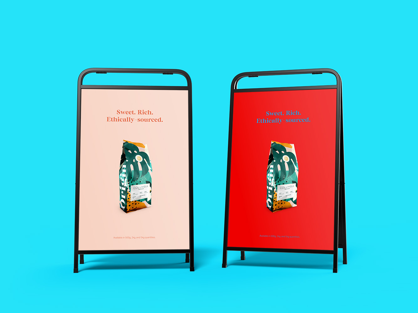
How Colours Affect Your Design
The colour you choose speaks a lot about what emotion you’re trying to convey. We went with orange to inspire a sense of playfulness and energy. What are you trying to say with your design? Pick colours that convey emotions you want people to feel. If you want to show excitement or a sense of importance, try using red. If you want to appear trustworthy or dependable, try using blue.
When you want to use multiple colours in your design, it’s important to choose colours that are complementary to each other. Avoid using colour combinations such as yellow on green, or blue on red. These colours do not have good contrast, and makes text less readable.


Conclusion
At the end of the day, it’s not only what you use to communicate with your customers that’s important, but also how you communicate it. Remember that your signage is an extension of your brand, so make sure the look and feel of the design reflects that.
If you’d like to pick our brains one-on-one on how your business can make use of sandwich boards or other signages, feel free to reach out to us. We’d love to work with you on your project.